Scaled Bar Graphs
- Drawing a Scaled Bar Graph – Introduction
- What Is a Scaled Bar Graph?
- Scaled Bar Graph – Definition
- Scaled Bar Graph vs. Bar Graph


 Do you want to learn faster and more easily?

Basics on the topic Scaled Bar Graphs
Drawing a Scaled Bar Graph – Introduction
Do you know what you want to be when you grow up? Some people are really passionate about something and want to start their own business. In this case, they often need money from the bank to keep their company growing. However, the bank will need to see some sales data before lending. This is where scaled bar graphs come into play. In this video and text, you can learn how to organise information into scaled bar graphs.
What Is a Scaled Bar Graph?
Let’s learn more about scaled bar graphs and how we draw one with the following explanation.
Scaled Bar Graph – Definition
A scaled bar graph is a special type of bar graph that uses repeating intervals greater than one to measure the data represented. This is helpful because it allows the graph to show larger ranges of data. Unlike a scaled picture graph, a scaled bar graph does not have a key.
Scaled Bar Graph vs. Bar Graph
A bar graph is a general term that refers to a type of graph that uses columns to represent sets of information. Whereas a scaled bar graph is a particular type of bar graph that uses a scaled key to represent and consolidate larger amounts of data.

How Do You Draw a Scaled Bar Graph?
We start drawing a scaled bar graph by identifying our data set. This is the information that we organise and display in the graph. It is important to give this data a name to explain what it represents. This name becomes the title of our graph and will tell our readers what it is about.

Next, we use our data set to begin labelling the axis on our graph. Typically, the x-axis, or horizontal line, represents the data’s categories. Each category is labeled on the x-axis. Then, the entire x-axis is given a name, or subtitle, so readers can identify the types of information.

Then, we move to the y-axis, or vertical line. Typically, this is where we find the bar graph’s scale. It is the axis that measures the data using a scaled number line. We label this axis with the units it represents (example: time, total number, etc.). The scale must include all the values in the data set. We determine the graph's range by looking at the smallest and largest numbers in the set. Then, we determine the scale by looking at the other numbers to see if they share a common factor to count up by. This factor becomes our scale’s interval. Once the range and interval are determined, we draw the scale on the axis. Scales should begin at zero and go up at the determined interval. They should end one interval past the largest number in the data set.

Finally, we plot the data. Carefully draw each bar by finding the data in the set. Match it with the same category on the x-axis and draw your bar from zero to the total number. Repeat this process until all the data has been plotted.

Determine the Scale on a Bar Graph
Learn how to work out the scale for a bar graph below.
How Would You Choose a Scale on a Bar Graph?
To determine a bar graph's scale interval, find the smallest and largest numbers in the data set to define the range. Then, look at the other numbers in the set to see if they share a common factor to count up by. This common number becomes the scale’s interval. Once the range and interval are determined, draw the scale on the axis. Scales should begin at zero and go up at the determined interval. End the scale one interval past the largest number in the data set.
Types of Bar Graphs
Below are examples for scaled bar graphs.
Here you can see an example of a general scaled bar graph:
The following infographic shows a scaled bar graph with intervals of five:

Lastly, this is a scaled bar graph with intervals of ten:

Making a Scaled Bar Graph – Summary of Steps
| Order of steps | Details |
|---|---|
| first step | name the data set → title of the graph |
| second step | label categories on the x- and y-axes |
| third step | create scale for the y-axis (whole data set) look for a common factor to use as the interval |
| final step | plot data on the graph by drawing bars |
Have you practised yet? After the video, you can also find scaled bar graph worksheets and exercises. Enjoy!
Transcript Scaled Bar Graphs
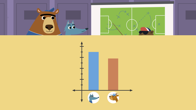
Gus and Nari have started a honey business and need money from the bank to keep it growing, BUT the bank asked for their honey sales data before lending money.
Let's help Nari and Gus make scaled bar graphs to show their data!
Drawing a Scaled Bar Graph
Remember! A bar graph is a type of graph that uses columns to represent sets of information!
In a SCALED bar graph, the scale that measures the bars uses repeating intervals greater than one.
Our first graph will show how many honey jars Nari and Gus sell each week.
First, we'll represent the data by titling the graph WEEKLY HONEY SALES.
Next, we will look at our DATA SET. This is the information we know about the sales each week.
We'll use the data set to start drawing our graph.
The x-axis, or horizontal line, represents our weekly data, so let's write one, two, three like the paper and label it "Weeks".
The y-axis, or vertical line, measures the amount of jars sold, so we'll draw a scale that includes all of their sales.
We determine the graph's scale by looking at the smallest and largest numbers to include the ENTIRE data set.
Then, we look at the other numbers to see if they share a common factor to count up by.
All of the numbers in this data set are multiples of five, going from five to twenty five.
Our scale should begin at zero and go up in intervals of five until we reach thirty, one interval past our largest number.
It's time to plot our data on the graph.
During week one, Nari and Gus sold five jars.
Let's draw a bar from zero to five.
Nari and Gus sold twenty jars in week two, so we draw a bar from zero to twenty above 'week TWO'.
What do we draw above 'week three'?
Nari and Gus sold 25 jars, that means we need to draw a bar from zero to twenty five above week three.
Now that we've completed the first graph, let's make one more.
Our second graph needs to show which honey is the most popular.
We begin by giving our graph a title.
Let's call it FAVOURITE FLAVOURS, so we know what the data represents.
To start our graph, what do we write on the x-axis? This data set includes the most popular flavours: Wildflower, Clover, Blossom. So, we'll write the most popular flavours on the x-axis. What do we draw on the y-axis? We draw the scale that includes how many customers like each flavour. Remember, we determine the scale by looking at the smallest and largest numbers to include the ENTIRE data set. Then, we look at the other numbers to see if they share a common factor to count up by. MOST of this data set are multiples of TEN and include the numbers fifteen to forty. Our scale should begin at zero and go up in intervals of ten until we reach fifty, one interval past our largest number. Let's plot our data on the graph. Nari and Gus have thirty customers who like Wildflower, so here we draw a bar that begins at zero and reaches thirty. What will we draw above the word Clover? We will draw a bar that begins at zero and reaches forty, because they have forty customers who prefer Clover. If they have fifteen customers who like Blossom the most, what do we draw there? We draw a bar that only reaches HALFWAY between ten and twenty on the scale, because fifteen is halfway between them!" Before Nari and Gus can present to the bankers, let's review: When drawing a scaled bar graph, first, title your graph by naming the data set. Next, label your categories on the x and y axis. Then, create a scale for your Y-axis by including the whole data set and looking for a common factor to use as the interval.
And, finally, plot your data on the graph by drawing your bars.
"So, you can surely see this would BEE a fantastic investment!"
"Im so glad they decided to invest in Sticky Fingers!" "Me too. THIS is just the kind of strategic purchase we NEEDED to get this honey company off the ground!"
Scaled Bar Graphs exercise
-
Read and interpret a bar chart.
HintsLook at the intervals that the numbers are going up in on the y axis. Can you use this to help you work out the value?
Choose a day, e.g. Thursday. Look up the y axis and see what number the Thursday bar reaches. This is how may pots were sold.
Begin with Monday. Look up the y axis to see how many pots were sold on Monday. Look how high the Monday bar goes, what number is it in line with?
Solution• Monday = 10 pots sold
• Tuesday = 40 pots sold
• Wednesday = 15 pots sold
• Thursday = 35 pots sold
-
How much honey was sold each day?
HintsTo find the most sales, look at the bar which is the tallest against the y axis. The least sales is always the shortest bar.
To find which day sold 20 pots, first find 20 on the y axis, then go across the bar chart to see which day's bar reaches 20.
This shows that there were more sales on Saturday than Wednesday.
No bar on the chart for a day means 0 sales.
SolutionBegin by finding how many pots of honey were sold on each day.
Least sales= lowest bar
Most sales = highest bar
------------------------------------------------------------
This week the sales have been great! The most sales were made on Saturday and the least were made on Sunday.
On Monday there were only 20 pots sold but on Wednesday 65 pots were sold.
There were more sales on Saturday than Wednesday. There were fewer sales on Tuesday and Thursday than Wednesday.
-
How many books did each class read?
HintsLook at the intervals that the numbers on the y axis are going up in. Use this information to find halfway between the numbered intervals.
To begin with, find how many books each class has read. For example, the bar for year 3 goes up to 240 so they have read 240 books.
The word 'combined' means altogether. This means you need to add the two amounts together.
To find which class Year 6 have read 20 more books than, first look at how many books Year 6 have read. Then, subtract 20 from this amount.
Solution1. Start by finding how many books each Year has read.
- Year 1: 80
- Year 2: 140
- Year 3: 240
- Year 4: 140
- Year 5: 200
- Year 6: 220
- 350 – 240 = 110
- 350 – 200 = 150
- 80 + 140 = 220
- 220 – 200 = 20
- 240 – 220 = 20
-
When did sales increase the most?
HintsBegin by finding the profits made in each week. Look at each bar and refer to the y axis. For example, in week 1, a profit of £20 was made.
To find the increase in sales week on week, find the difference between the two. In week 1 there was £20 profit. In week 2 there was £30 profit. The difference here (£30 – £20) = £10. So the increase from week 1 to 2 is £10.
SolutionThe increase in profits can be found by finding the difference between the two bars. First, the profit between weeks 1 to 2 (£30 – £20 = £10).
Once you have found the differences between weeks 1-2, 2-3, 3-4 and 4-5, you can then see where the biggest increase lies.
-
Which honey flavour is the most popular?
HintsStart by finding the flavour that is least popular. This means it has the fewest or lowest sales.
Most popular means that they were the highest sales, so it will be the highest bar on the graph.
SolutionTo order the flavour sales from least to most popular, we start with the lowest sales.
Clover 20 pots LOWEST SALES
Wildflower 25 pots
Buckwheat 30 pots
Blossom 35 pots HIGHEST SALES
-
Which sport do children prefer?
HintsTo find how many more children like rugby than tennis, look at the difference between the two.
To find how many children were questioned altogether, you need to add all of the bars together as each child answered once.
The word 'fewer' means 'less'. The the bar that is lower than another, has fewer votes. 'Twice as many' means double.
Begin by finding how many children like each sport. For example, for swimming, find the top of the bar and look at the y axis. This shows that 25 children like swimming.
SolutionTwice as many children like football than tennis. FALSE
Tennis was the most popular sport chosen. FALSE
More children liked swimming than rugby or tennis. FALSE
Fewer children liked tennis than rugby. TRUE
5 more children liked rugby than tennis. TRUE
Altogether, 30 children were asked about their favourite sport. FALSE
--------------------------------------------------------------------------------------
Begin by finding how many children like each sport.
Most popular is football (30), the tallest bar.
Fewer children liked tennis (20) than rugby (25)
Altogether means add all the bars. (30 + 25 + 20 + 25 = 100)
5 more children liked rugby than tennis ( 25 - 20 = 5)
Twice as many children did not like football than tennis (20 x 2 = 40)