Comparing Data in Bar Graphs


 Do you want to learn faster and more easily?

Basics on the topic Comparing Data in Bar Graphs
How Can a Bar Graph Help You Compare Data?
Imagine this: you have collected data about the weather to try to predict what the weather will be like the next day so you can plan a day at the beach. You have recorded the total number of sunny, rainy and windy days. Let’s see how you can compare this data with the help of a bar graph!
Bar Graphs – Definition
What is a bar graph? A bar graph is a type of graph that displays data in bars. Data is information that has been collected and put into groups based on things it has in common.
Setting up Bar Graphs
A bar graph can be used to compare sets of data. For example, you can compare the types of weather you have had over the past few days. In order to set up a bar graph, you first need a set of data you want to visualise in a bar graph. Here are the recorded types of weather during the last couple of days.
| Type of weather | # of days |
|---|---|
| sunny | 8 |
| windy | 5 |
| rainy | 7 |
We have three different types of weather and a maximum number of eight days. So now it is time to set up our bar graph. This is how it may look:

Here we have the days shown on the left side of the bar graph and the types of weather across the bottom. Now it is time to fill in our data. To record the data, count how many times a category appears and draw a bar that reaches to the number.

Comparing Data using Bar Graphs
When comparing data in bar graphs we need to look at the bars. Here we can see that there have been eight sunny days as the sun bar goes up to eight on the scale. We can see that this bar is the tallest. That means there have been more sunny days than windy or rainy days.
We can also see that the wind bar is the shortest. This means that there have been fewer windy days than sunny or rainy days.
Comparing Data with Bar Graphs – Summary
Remember, data is information that has been collected and sorted into groups. We can use a bar graph to answer questions about data, for example;
- How many are in each group?
- Which group has more?
- Which group has fewer?
Want more practice on comparing sets of data? After watching the video there are more interactive exercises, worksheets and further activities for practising the use of bar graphs.
Transcript Comparing Data in Bar Graphs
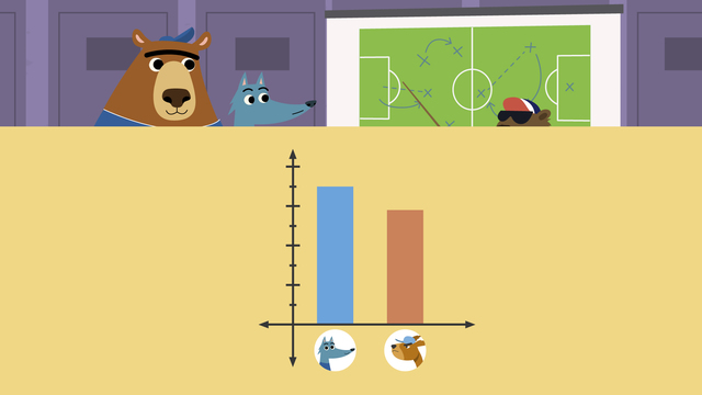
"The weather has been really sunny recently. Tomorrow, I think we should go to the beach." "Hmmm...I don't think the weather is always the same." "Maybe we can look at some weather data to guess what the weather might be like tomorrow!" We can help Nari and Gus by comparing data in bar graphs. Data is information that we collect and put into groups based on things it has in common. When we put data on a graph, it makes it easier to see and understand. Here is a bar graph of weather data that Nari and Gus collected. It's called a bar graph because the data is in the shape of bars! Across the bottom, you can see the three types of weather: sunny, windy and rainy. Up the side you can see the numbers one to nine and the label, 'Days'. The label tell us the numbers are counting how many days had each type of weather. In the centre of the graph are the bars that show how many days each type of weather occurred. Let's look at the chart to ask and answer questions about the data. We will compare the data by looking at which type of weather occurred on more days and which type occurred on fewer days. First, let's see how many days had each type of weather. How many days had sunny weather? Point to the sun on the graph. Now look at the bar and move your finger to find where it stops. The bar stops on the number eight. This means there were eight days of sunny weather. How many days had windy weather? Find the wind and look at where the bar stops. There were five windy days. How many days had rainy weather? There were seven rainy days. Which type of weather occurred on the most number of days? Looking at our graph, we look for which bar is the tallest. The sun bar is the tallest, so there were more sunny days than windy and rainy days. Which type of weather occurred on the fewest number of days? Looking at our graph, we look for which bar is the shortest. The wind bar is the shortest, so there were fewer windy days than sunny or rainy days. How many more days were sunny than rainy? First, look at the sun and the rain bars. Then, find the number of days each bar shows the sun bar has eight and the rain bar has seven. There was one more sunny day than rainy day. Remember, today we learnt about comparing data. Data is information that we collect and put into groups based on things it has in common. When we put data on a graph, it makes it easier to see and understand. A bar graph can help us answer questions about data. We can compare information like how many are in each group and which groups have more or less. "See, we have more sunny days, so tomorrow will be sunny!"
Comparing Data in Bar Graphs exercise
-
Can you highlight the bar graph?
HintsWhich bar is the tallest? This represents the weather that occurred the most.
Which bar is the shortest? This represents the weather that occurred the least.
SolutionSnowy was the type of weather that occurred the least. We can see from the bar graph that it only snowed on 3 days.
Cloudy was the type of weather that occurred the most. We can see from the bar graph that it was cloudy on 6 days.
-
What has the weather been like?
HintsLine up the top of each bar with the numbers on the side.
The taller the bar, the more days that type of weather occurred.
SolutionIf we line the top of each bar up with the numbers on the side, we find that there were:
- 4 sunny days
- 5 rainy days
- 3 snowy days
- 6 cloudy days
-
Can you sort the data?
HintsWhich bar is the tallest? This is the most popular flavour and will go first.
If there is no bar, that means that 0 of Nari and Gus's friends chose that flavour, making it the least popluar.
Solution- Vanilla was the most popular flavour. 5 friends chose this flavour.
- Strawberry was the next most popular. 3 friends chose this flavour.
- Next was chocolate. 2 friends chose this flavour.
- The least popular flavour was mint choc chip. 0 friends chose this flavour.
-
Which colours are the friends' favourite?
HintsUse the data that you have to fill in the gaps in the table. Which number does each bar line up to?
When thinking about the most popular colour, use all of the data you have.
- Which bar is the tallest?
- Which number is the biggest?
When thinking about the least popular colour, use all of the data you have.
- Which bar is the shortest?
- Which number is the smallest?
SolutionHere is the completed table:
- The most popular colour was green as 8 friends chose this colour, which is more than any other.
- The least popular colour was yellow as 1 friend chose this colour, which is fewer than any other.
-
Which was the most popular fruit?
HintsMost popular means the option that was chosen the most times.
Which bar is the tallest? This is the most popular choice.
SolutionApple was the most popular choice.
7 friends chose apple as their favourite fruit, compared to 4 for banana, 5 for orange and 2 for pear. This means that more friends chose apple, making it the most popular choice.
-
Which charts represent the same data?
HintsWork out what each chart is representing. How many people have each eye colour?
Three images represent the same data set.
The charts that are representing the same data all have the same number in each category.
SolutionThis is the data set that was being represented in three images:
- the tally chart
- the bar graph
- the pictogram
- 6 had brown eyes
- 3 had blue eyes
- 8 had grey eyes
- 1 had green eyes


i like the video