Scatter Plots
 Do you want to learn faster and more easily?
Learning text on the topic Scatter Plots
Scatter Plots – Definition
In everyday life, we often see graphs that show how two things are related, like how much exercise people do and how much water they drink. In maths, we use scatter plots to find patterns in this type of data. They are also more commonly called scatter graphs. Scatter graphs provide a simple yet powerful way to visualise and analyse the relationship between two variables. Whether in the classroom or real-world applications, they help us understand trends, make predictions, and identify unusual patterns. By plotting individual data points on a graph, scatter plots enable us to quickly discern whether a relationship between variables exists, and if so, what kind of relationship it is.
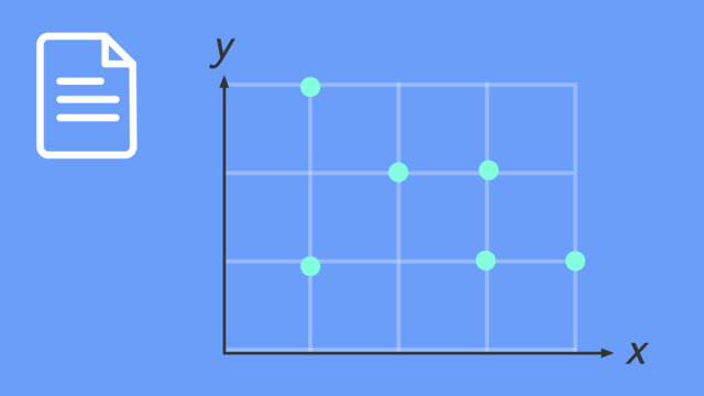
A scatter plot is a type of graph used in statistics to show the relationship between two different sets of data. On a scatter plot, each point represents a pair of values.

Scatter Plots – Variables
Scatter plots (or scatter graphs) are essential tools in statistics and data analysis. They help us see if there is a relationship between two variables, also known as bivariate data, such as height and weight, or study time and test scores. In these plots, we often deal with two types of variables: independent and dependent.
| Variable Type | Description | Position in Scatter Plot | Example |
|---|---|---|---|
| Independent Variable | The variable that you change or control in an experiment. | Typically plotted on the $x$-axis. | Amount of time spent studying. |
| Dependent Variable | The variable that depends on the independent variable and what you measure in the experiment. | Usually plotted on the $y$-axis. | Test scores in a study about study time. |

Bivariate Data: This term refers to when you look at two variables together to see how they relate. For example, you might compare rainfall amounts with how well crops grow. Each point on a scatter plot shows one set of these two things, which helps us see if they might affect each other.
Understanding the roles of independent and dependent variables in scatter plots is essential for correctly interpreting the data. These plots are mainly used to examine the effect of the independent variable (like rainfall) on the dependent variable (like crop growth). This understanding is especially important in fields such as science, economics and social research, where predicting trends and analysing variable relationships is key.
How to Graph a Scatter Plot
Let's create a scatter graph comparing the number of hours of sleep a student got with the score they received on their latest maths test.

Step 1: Choose and Define Two Variables
For our scatter graph, we will compare:
- $x$-axis (Independent Variable): Number of hours of sleep
- $y$-axis (Dependent Variable): Test score (%)
Step 2: Draw and Label Axes Create a horizontal line ($x$-axis) and a vertical line ($y$-axis) on graph paper or in a graphing tool.
- Label the $x$-axis as "Hours of Sleep."
- Label the $y$-axis as "Test Score (%)."
Step 3: Choose an Appropriate Interval
Before plotting the data, it's important to choose suitable intervals for the axes. This will help in accurately placing and reading the data points.
- For the $x$-axis (Hours of Sleep), consider the range of hours you want to include. For example, you might choose an interval of 1 hour and range from 0 to 12 hours.
- For the $y$-axis (Test Score), choose an interval that makes sense for test scores. You might use an interval of 10% for grades ranging from 0 to 100%.
Choosing the right intervals will make your scatter plot more readable and your data easier to interpret.

Step 4: Plot Points
The data in the table can be translated into coordinates ($x$,$y$).

Plot each coordinate on the graph where the $x$-value (hours of sleep) and $y$-value (test score) intersect.

Constructing a Scatter Plot – Guided Practice
It’s your turn to create a scatter plot, you will need a piece of graph paper and a pencil to try it yourself.
You're curious if warmer weather leads to more ice cream sales. Using data from the past week, plot a scatter plot with temperature (in °C) on one axis and ice cream sales (in £) on the other to investigate this.


Scatter Plot Trends


Linear and Non-Linear Trends
Scatter plots not only show relationships between two variables but also reveal the nature of these relationships. There are two primary types of trends that scatter plots can illustrate: linear and non-linear.
Linear Trends
A linear trend in a scatter plot shows a straight-line relationship between the variables. This means as one variable increases or decreases, the other variable changes at a constant rate.
Real-World Example: A linear trend could be seen in a scatter plot comparing the speed of an internet connection to the time it takes to download a large file. Generally, as internet speed increases, the download time decreases consistently.
Non-Linear Trends
A non-linear trend indicates that the relationship between the variables changes at different rates. This trend is represented by a curved line on the scatter plot.
Real-World Example: An example of a non-linear trend could be the relationship between speed and fuel efficiency in cars. Initially, as speed increases, fuel efficiency improves, but after reaching an optimal speed, further speed increases might decrease efficiency.

Understanding these trends is crucial for interpreting scatter plots accurately. It allows us to make more nuanced predictions and understand complex relationships in data, which is especially important in fields like environmental science, economics and engineering.
Scatter Plots – Real-World Application
Scatter plots are incredibly useful in various real-world situations, particularly for making predictions. A common application is in understanding consumer behaviour based on environmental factors.
Consider a situation where a local business wants to estimate the number of beachgoers based on the day's temperature. They collect data over several weeks to analyse the trend and make predictions.
| Temperature (°C) | Beach Attendance |
|---|---|
| 21 | 120 |
| 24 | 200 |
| 26 | 180 |
| 29 | 210 |
| 31 | 190 |
| 34 | 220 |

Prediction: At 32°C, predicting beach attendance becomes more nuanced due to the non-linear trend. The business might expect attendance to be around 200, considering the fluctuations observed at similar temperatures.
Scatter plots and their line of best fit in these scenarios are valuable for their ability to reveal complex patterns and trends that are not immediately obvious, aiding in more accurate predictions and better decision-making.
Constructing Scatter Plots – Exercises
Grab some graph paper and try the following scatter plot problems on your own!


Scatter Plots – Summary
Key Learnings from this Text:
- Scatter plots (or scatter graphs) display the relationship between bivariate data (two variables).
- They help identify patterns, associations, outliers and clusters in data.
- Positive association shows an upward trend, negative association shows a downward trend and no association indicates a random pattern.
- Scatter plots can show either linear trends, where data points form a straight line, or non-linear trends, where the data points create a curved pattern.
- Scatter plots are valuable tools in statistics and real-world data analysis.
Scatter Plots – Frequently Asked Questions
Scatter Plots exercise
-
What do these key terms mean?
HintsThe prefix "bi-" means two, twice or double. Is there an answer that mentions two variables?
If something is independent, it means it is unaffected by other items. An example of an independent variable would be time. This is always plotted on the x-axis of a graph.
When something is dependent on something else, it often means it is affected by another variable. An example might be how the number of ice cream sales would increase as the hotter the average temperature was for each day. We would say, the ice cream sales are dependent on the average temperature of the day. The ice cream sales would be plotted on the y-axis.
René Descartes conceived the idea of the Cartesian plane while observing a fly on his bedroom ceiling, aiming to pinpoint its precise location by using a grid system. The x and y axis form a grid system.
Could you look in the text to find the definitions to help you complete this task?
SolutionBivariate Data - This refers to a set of data that involves two variables. Each data point in this kind of data consists of paired observations or measurements for two different variables.
Independent Variable - The variable that you change or control in an experiment, typically plotted on the x-axis
Dependent Variable - The variable that depends on the independent variable and what you measure in the experiment, usually plotted on the y-axis.
Cartesian Plane - The two-dimensional coordinate plane, which is formed by the intersection of the x-axis and y-axis. The origin is the name of the co-ordinate where both the axes cross.
-
Plotting co-ordinates
HintsRemember in a co-ordinate the x value comes first and then the y value comes second.
An example would be $(20,50)$.
The coordinate $(20,60)$ is plotted on the cartesian plane. This was plotted by starting at the point $(0,0)$, and first, moving 20 units along the x-axis and then, from this point, moving 60 units up the y-axis. A cross is then drawn where the point $(20,60)$ is plotted on the graph axes. You can see this in the illustration.
Have you looked back at the text on how to plot co-ordinates?
SolutionThe co-ordinates which should be highlighted are:
- $(10, 10)$
- $(30, 20)$
- $(70, 40)$
- $(50, 30)$
- $(90, 25)$
-
Identifying Outliers
HintsHave a look at the graph included which has been taken from the text. See how the outlier is located at the point $(8,20)$. It is a data point which is an abnormal distance from the other data points. Usually they are visually obvious!
In the real world, an outlier can be exemplified by a scenario where you're analysing data containing ages, and suddenly you come across a data point suggesting someone's age is 200. This instance would qualify as an outlier since it deviates significantly from the typical range of data points.
Have you read the text to check what an outlier is?
SolutionThe two co-ordinates plotted in the upper right of the axes, that are not plotted in the downward trend like the remaining other co-ordinates, are the two outliers.
The data they represent does not fit the downward trend of the other co-ordinates.
-
Linear and Non-linear trends
HintsHave you checked the text for helpful hints on what linear and non-linear trends are?
Linear means in a straight line. This line may be horizontal or vertical but most often in a diagonal line when looking at the trends of data on scatter graphs. Look at the graph for an example of what a linear trend looks like.
Non-linear means not in a straight line! This would mean it is often in some sort of curved overall shape of the data trend.
SolutionA linear trend in a scatter plot shows a straight-line relationship between the variables. This means as one variable increases or decreases, the other variable changes at a constant rate.
A non-linear trend indicates that the relationship between the variables changes at different rates. This trend is represented by a curved line on the scatter plot.
-
Types of Correlation
HintsPositive correlation refers to a trend where data points on a graph gradually rise from the bottom left corner to the top right corner.
Negative correlation describes a trend where data points on a graph decrease from the top left corner to the bottom right corner.
No correlation suggests the points scatter randomly without following a clear pattern.
SolutionThe graph with the data points plotted in a trend that goes from bottom left up towards the top right of the axes shows a positive correlation.
The graph with the data points plotted in a trend that goes from top left down towards the bottom right of the axes shows a negative correlation.
The other graphs all show no correlation. There are three graphs; one with the data points plotted all over the graph, one where the points are plotted in a horizontal line as well as one where the points are plotted in a vertical line too.
-
What do you know about lines of best fit?
HintsA line of best fit does not always need to pass through the origin, (0,0)
A non-linear trend may have a curved line of best fit
There are 3 correct statements.
Have you looked at the examples in the text of graphs with line of best fits on? Could you use this to help you assign some of the statements?
SolutionThese statements are correct:
- Line of best fit should pass through as many points as possible on a scattergraph, evenly dividing those it can't above and below.
- A line of best fit will always match the correlation of the data
- The line of best fit should span the whole graph in which there have been co-ordinates plotted.
- A line of best fit must pass through the origin, (0,0).
- A line of best fit must be a straight line.
- A line of best fit must pass through all of the points plotted on a scatter graph
- There is always only one correct line of best fit for a graph.